
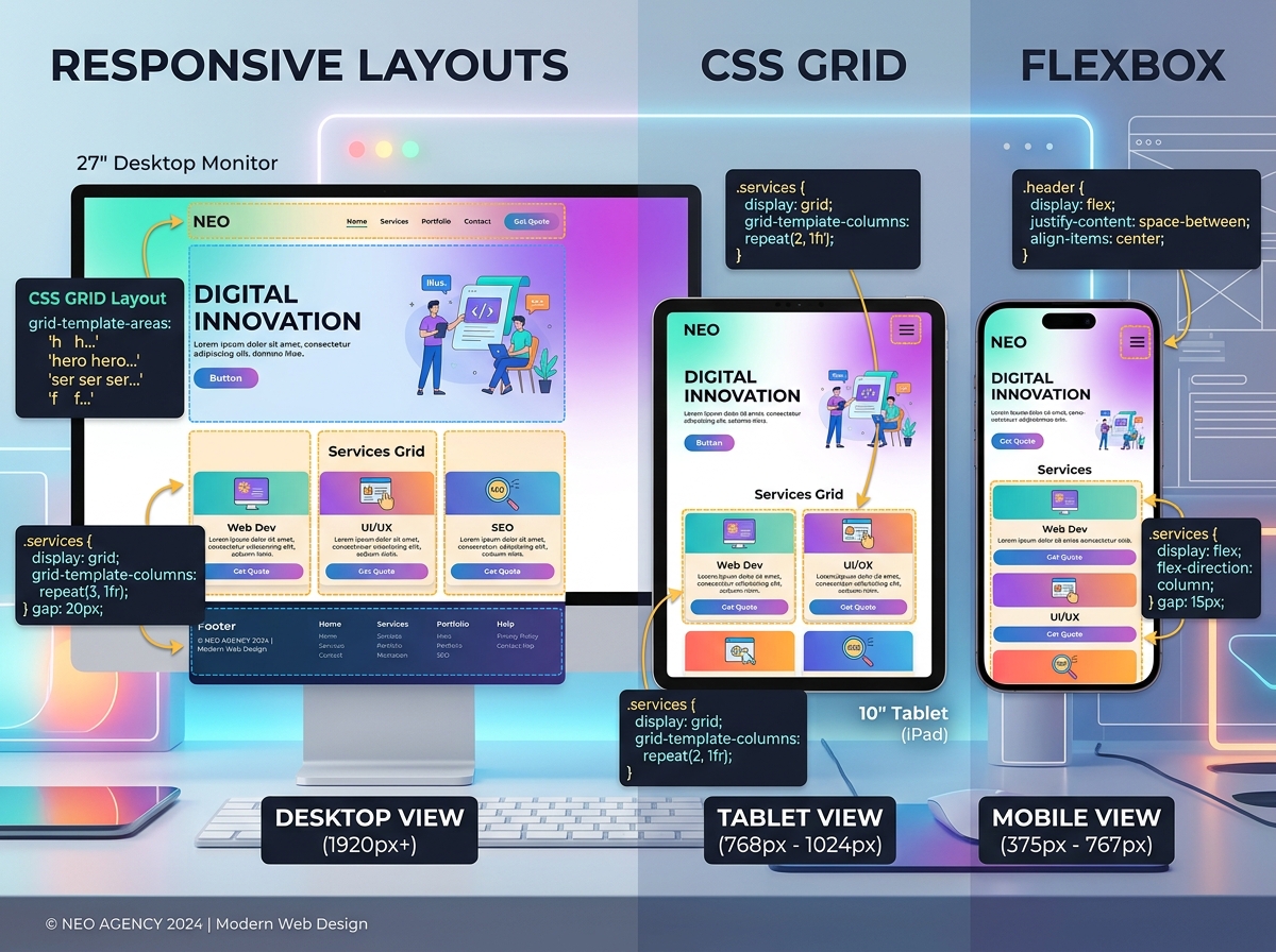
CSS Grid and Flexbox have revolutionized web layout. This tutorial builds a complete responsive landing page from scratch, teaching you when to use Grid versus Flexbox and how to combine them effectively.
Project Overview We'll build a SaaS landing page with:
-
Header with navigation
-
Hero section
-
Features grid
-
Pricing cards
-
Footer
Step 1: HTML Structure
HTML
<!DOCTYPE html>
<html lang="en">
<head>
    <meta charset="UTF-8">
    <meta name="viewport" content="width=device-width, initial-scale=1.0">
    <title>Modern Layout Tutorial</title>
    <link rel="stylesheet" href="styles.css">
</head>
<body>
    <header class="header">
        <nav class="nav">
            <div class="logo">TechSaaS</div>
            <ul class="nav-links">
                <li><a href="#features">Features</a></li>
                <li><a href="#pricing">Pricing</a></li>
                <li><a href="#contact">Contact</a></li>
            </ul>
            <button class="cta-button">Get Started</button>
        </nav>
    </header>

    <section class="hero">
        <div class="hero-content">
            <h1>Build Faster with Our Platform</h1>
            <p>Streamline your workflow and scale your business</p>
            <button class="hero-cta">Start Free Trial</button>
        </div>
        <div class="hero-image">
            <img src="dashboard.jpg" alt="Dashboard">
        </div>
    </section>

    <section class="features" id="features">
        <h2>Powerful Features</h2>
        <div class="features-grid">
            <div class="feature-card">
                <h3>Analytics</h3>
                <p>Real-time insights into your business metrics</p>
            </div>
            <div class="feature-card">
                <h3>Automation</h3>
                <p>Automate repetitive tasks and save hours</p>
            </div>
            <div class="feature-card">
                <h3>Security</h3>
                <p>Enterprise-grade security for your data</p>
            </div>
            <div class="feature-card">
                <h3>Integration</h3>
                <p>Connect with 100+ popular tools</p>
            </div>
        </div>
    </section>

    <section class="pricing" id="pricing">
        <h2>Simple Pricing</h2>
        <div class="pricing-cards">
            <div class="pricing-card">
                <h3>Starter</h3>
                <p class="price">$9/month</p>
                <ul>
                    <li>5 Projects</li>
                    <li>Basic Analytics</li>
                    <li>Email Support</li>
                </ul>
                <button>Choose Plan</button>
            </div>
            <div class="pricing-card featured">
                <h3>Pro</h3>
                <p class="price">$29/month</p>
                <ul>
                    <li>Unlimited Projects</li>
                    <li>Advanced Analytics</li>
                    <li>Priority Support</li>
                </ul>
                <button>Choose Plan</button>
            </div>
            <div class="pricing-card">
                <h3>Enterprise</h3>
                <p class="price">Custom</p>
                <ul>
                    <li>Everything in Pro</li>
                    <li>Custom Integrations</li>
                    <li>Dedicated Manager</li>
                </ul>
                <button>Contact Sales</button>
            </div>
        </div>
    </section>

    <footer class="footer">
        <p> 2026 TechSaaS. All rights reserved.</p>
    </footer>
</body>
</html>
Step 2: CSS Reset and Base Styles
css
/* Reset */
* {
    margin: 0;
    padding: 0;
    box-sizing: border-box;
}

/* Base */
body {
    font-family: 'Segoe UI', system-ui, sans-serif;
    line-height: 1.6;
    color: #333;
}

img {
    max-width: 100%;
    height: auto;
    display: block;
}

a {
    text-decoration: none;
    color: inherit;
}

button {
    cursor: pointer;
    border: none;
    padding: 0.75rem 1.5rem;
    border-radius: 0.5rem;
    font-size: 1rem;
    transition: all 0.3s ease;
}
Step 3: Header with Flexbox
css
.header {
    background: #fff;
    box-shadow: 0 2px 10px rgba(0,0,0,0.1);
    position: sticky;
    top: 0;
    z-index: 100;
}

.nav {
    max-width: 1200px;
    margin: 0 auto;
    padding: 1rem 2rem;
    display: flex;
    justify-content: space-between;
    align-items: center;
    flex-wrap: wrap;
    gap: 1rem;
}

.logo {
    font-size: 1.5rem;
    font-weight: bold;
    color: #0066FF;
}

.nav-links {
    display: flex;
    list-style: none;
    gap: 2rem;
}

.nav-links a:hover {
    color: #0066FF;
}

.cta-button {
    background: #0066FF;
    color: white;
}

.cta-button:hover {
    background: #0052cc;
    transform: translateY(-2px);
}
Step 4: Hero Section with Grid
css
.hero {
    max-width: 1200px;
    margin: 4rem auto;
    padding: 0 2rem;
    display: grid;
    grid-template-columns: 1fr 1fr;
    gap: 4rem;
    align-items: center;
}

.hero-content h1 {
    font-size: 3rem;
    line-height: 1.2;
    margin-bottom: 1rem;
    color: #1a1a1a;
}

.hero-content p {
    font-size: 1.25rem;
    color: #666;
    margin-bottom: 2rem;
}

.hero-cta {
    background: #FF6B6B;
    color: white;
    font-size: 1.1rem;
    padding: 1rem 2rem;
}

.hero-cta:hover {
    background: #ff5252;
    transform: translateY(-2px);
    box-shadow: 0 10px 20px rgba(255,107,107,0.3);
}

.hero-image {
    border-radius: 1rem;
    overflow: hidden;
    box-shadow: 0 20px 40px rgba(0,0,0,0.1);
}
Step 5: Features Grid
css
.features {
    max-width: 1200px;
    margin: 6rem auto;
    padding: 0 2rem;
}

.features h2 {
    text-align: center;
    font-size: 2.5rem;
    margin-bottom: 3rem;
}

.features-grid {
    display: grid;
    grid-template-columns: repeat(auto-fit, minmax(250px, 1fr));
    gap: 2rem;
}

.feature-card {
    padding: 2rem;
    border-radius: 1rem;
    background: #f8f9fa;
    transition: transform 0.3s ease, box-shadow 0.3s ease;
}

.feature-card:hover {
    transform: translateY(-5px);
    box-shadow: 0 15px 30px rgba(0,0,0,0.1);
}

.feature-card h3 {
    color: #0066FF;
    margin-bottom: 0.5rem;
    font-size: 1.25rem;
}
Step 6: Pricing Cards with Flexbox
css
.pricing {
    max-width: 1200px;
    margin: 6rem auto;
    padding: 0 2rem;
}

.pricing h2 {
    text-align: center;
    font-size: 2.5rem;
    margin-bottom: 3rem;
}

.pricing-cards {
    display: flex;
    justify-content: center;
    gap: 2rem;
    flex-wrap: wrap;
}

.pricing-card {
    flex: 1;
    min-width: 280px;
    max-width: 350px;
    padding: 2.5rem;
    border-radius: 1rem;
    background: white;
    border: 2px solid #e9ecef;
    display: flex;
    flex-direction: column;
}

.pricing-card.featured {
    border-color: #0066FF;
    transform: scale(1.05);
    box-shadow: 0 20px 40px rgba(0,102,255,0.15);
}

.pricing-card h3 {
    font-size: 1.5rem;
    margin-bottom: 0.5rem;
}

.price {
    font-size: 2.5rem;
    font-weight: bold;
    color: #0066FF;
    margin-bottom: 1.5rem;
}

.pricing-card ul {
    list-style: none;
    margin-bottom: 2rem;
    flex-grow: 1;
}

.pricing-card li {
    padding: 0.5rem 0;
    border-bottom: 1px solid #e9ecef;
}

.pricing-card li::before {
    content: "✓ ";
    color: #28a745;
    font-weight: bold;
}

.pricing-card button {
    width: 100%;
    background: #0066FF;
    color: white;
}

.pricing-card button:hover {
    background: #0052cc;
}
Step 7: Responsive Design
css
/* Tablet */
@media (max-width: 768px) {
    .hero {
        grid-template-columns: 1fr;
        text-align: center;
        gap: 2rem;
    }

    .hero-content h1 {
        font-size: 2rem;
    }

    .nav-links {
        display: none; /* Add hamburger menu in production */
    }

    .pricing-card.featured {
        transform: none;
    }
}

/* Mobile */
@media (max-width: 480px) {
    .hero-content h1 {
        font-size: 1.75rem;
    }

    .features-grid {
        grid-template-columns: 1fr;
    }

    .pricing-cards {
        flex-direction: column;
        align-items: center;
    }

    .pricing-card {
        max-width: 100%;
    }
}
Step 8: Footer
css
.footer {
    background: #1a1a1a;
    color: white;
    text-align: center;
    padding: 2rem;
    margin-top: 6rem;
}
Key Concepts
When to Use Grid:
-
Overall page layout
-
Two-dimensional arrangements (rows AND columns)
-
Complex alignments
When to Use Flexbox:
-
One-dimensional layouts (single row or column)
-
Component-level alignment
-
Navigation menus
-
Centering content
Conclusion
CSS Grid and Flexbox are complementary tools. Grid handles macro layout; Flexbox handles micro layout. Together, they eliminate the need for layout frameworks in most projects. Practice combining them to build truly responsive, modern websites.